

A stencil output is a way of reading a design
One reference can contain contours, soft shadows, solid dark areas, and tiny textures. An output mode decides which of those signals becomes most visible. The right choice depends on the information you need to keep.
Stencra offers six outputs. They are different from the tattoo-style choices in AI Describe: choosing Traditional or Japanese guides an AI concept, while choosing Outline or Dotwork changes how the reference is rendered as a stencil. You can explore both stages separately.
Use the same reference when comparing outputs. That makes it easier to judge what each mode adds or removes, instead of being distracted by different subjects.
Outline: put the contours first
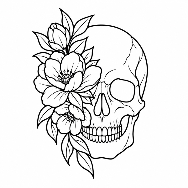
Outline emphasizes the edges that describe a shape. It is a useful starting point for lettering, botanical drawings, geometric elements, and references where the main structure matters more than surface texture.
Inspect small enclosed spaces, intersections, and repeated lines. A contour that looks elegant at full-screen size may become crowded when reduced. Try slightly simplifying the detail before increasing line weight across the entire design.
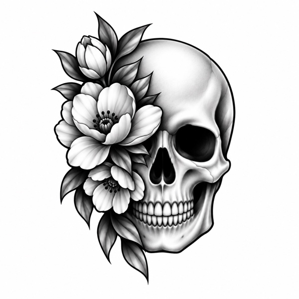
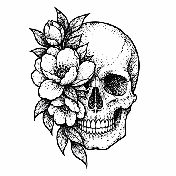
With the floral skull example, look at the separation between the teeth and the individual petals. Those spaces can tell you more about readability than the outside silhouette alone.
Tonal and Shading: keep the value information
Tonal uses stepped values to separate lighter and darker regions. It can help you see a reference as a set of larger areas instead of a collection of individual hairs, wrinkles, or fine textures.
Shading keeps softer transitions. Compare it when gradual light and shadow help describe volume, such as a rounded petal or the curvature of a face. A softly shaded image can be a useful reference, but that does not make every grey area equally useful on a transfer sheet.
View both modes at the planned print size. If the darker regions merge into a single block, return to the controls or compare a simpler output. Keep a separate reference image available when the stencil alone does not communicate all the shading decisions.
Dotwork: describe texture with points
Dotwork represents tonal information with stippled marks. It can give an open area a different visual rhythm from continuous shading or long lines.
The important comparison is spacing. Zoom out to check whether individual dots still read as texture or collapse into dense patches. The useful density will depend on the design’s dimensions and on how your printer reproduces small marks.
A generated dot pattern is a design aid. It does not prescribe needle placement or a tattooing technique. The artist still decides which information belongs in the working stencil.
Hatching and Crosshatch: give texture a direction
Hatching describes values with directional linework. Crosshatch layers intersecting lines to create denser texture. These outputs can be helpful when an engraved or drawn treatment fits the reference.
Compare the direction of the lines with the form underneath. Check where texture crosses an important contour, and where several dense areas meet. If the texture competes with the structure, reduce detail or try a cleaner outline as the working version.
A simple way to make the choice
- Begin with Outline. Use it to identify the essential structure.
- Compare a value-based version. See whether Tonal or Shading adds useful information.
- Explore texture only where it helps. Compare Dotwork, Hatching, or Crosshatch against your original intent.
- Check at the final size. Print a test if the design relies on fine spacing.
Save useful alternatives to a folder rather than forcing one output to serve every purpose. A clean working stencil and a richer visual reference can support different parts of the same design process.
Continue with the image-to-stencil workflow or the print-size checklist.
About this guide
Created with AI assistance and grounded in Stencra’s documented features. This guide covers digital artwork preparation, not tattooing technique or medical advice.